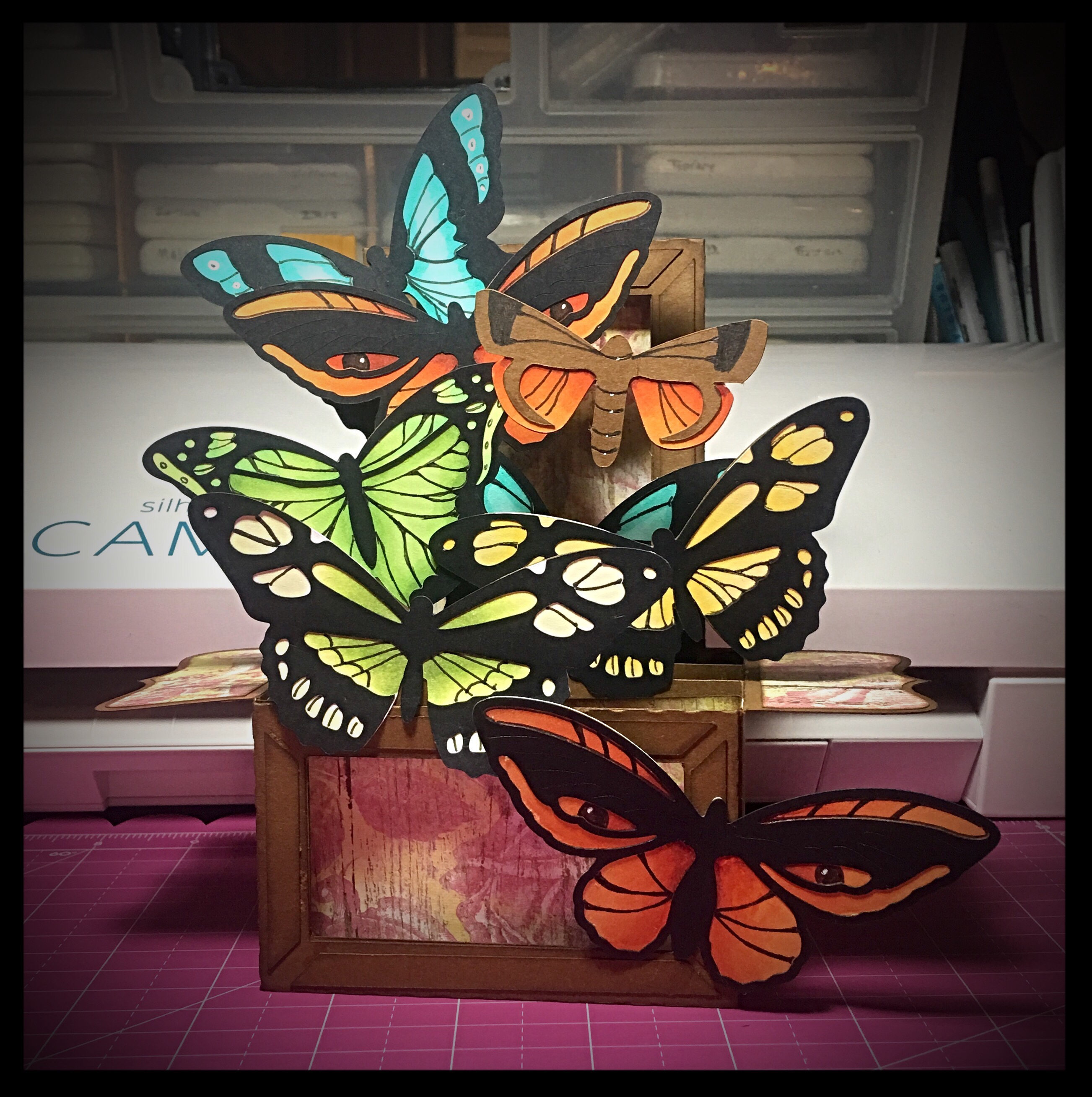
That Time I Made Lots of Mistakes

2 06 2022

Today, I learned a lot.

Mostly I learned what not to do.

But there is value in making mistakes, if we’re willing to learn from them.

I was playing with an idea to sublimate Bandit’s name onto a few things. I’m trying to put together an emergency bag for him that’s ready to go, including first aid items. We live in Tornado Land and it is that time of year. But we’ve also had ice storms in the winter that knock out power for four days. Gas leaks. People sitting in front of our house watching it…and more, I’m sure, because my life is NOT boring lol.

I found these bags at a good price, so it was worth experimenting with, especially because this one would stay in the basement unless we needed it. And if we need it, it will have character πŸ™‚

Here’s what I learned:

  1. Nylon straps melt at high temps. I’m sure I would have remembered if I’d taken time to think about it. In the future, I’ll just cut off this particular strap. I’ll get a better image that way, too. But I do have to clean the melted nylon glob off my heat press. Luckily, I have a teflon sheet attached to it. If I can’t clean it off, I can replace it. You can see some of the melted strap I’ve already scraped off on the silicone mat.
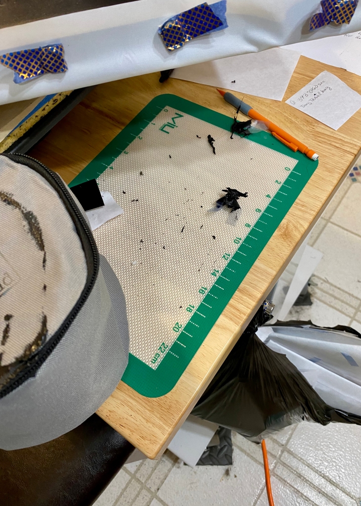
2. I learned that not only does the nylon strap melt, it impedes the transfer of the image. You can see that on the right hand side of the picture. In this set up, there was no way to move it far enough out of the way for a good transfer. But then again, it also wouldn’t have mattered since the strap melted. On the other hand, I also learned that I CAN sublimate on these bags, and the temp and time seem to work.
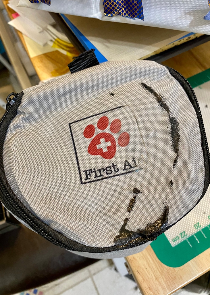
3. I also learned that the melted strap I hadn’t gotten off the teflon, was over further than I thought…Maybe I should have tried harder to clean it off, but I thought I had enough room to do the last transfer. I should have paid more attention to exactly where the glob would land. Because some of it got on to the other piece I was sublimating lol. You can see where it transferred on the bottom left. But again, this is an emergency bag, so this gives it character πŸ˜‰ And I now have a matched set πŸ˜€

In addition, the transfer on the bottom left is a little light. So I learned I need to move the image up just a little more to stop the seam from interfering.
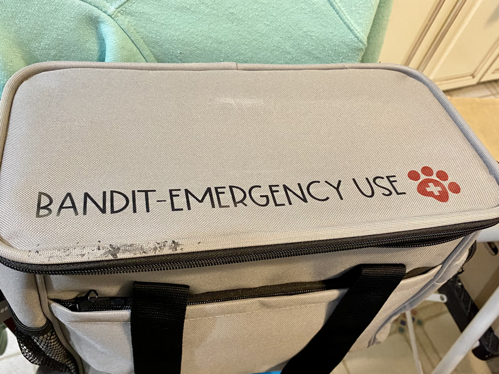
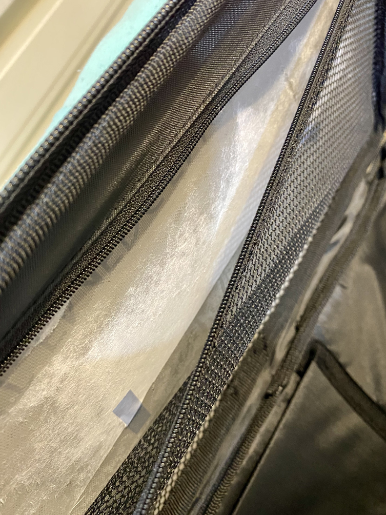
4. I learned that the top inside of this bag…melts a little πŸ™„

When sublimating, it’s usually wise to use some blow out paper on top of the image and under the substrate you’re sublimating on to, to catch any of the ink that could transfer to somewhere you don’t want it to go. The white part inside the zippered pouch…that’s the blowout paper. It’s stuck to the top of the bag now because the material above it melted a little. You can also see the blue tape I used to keep the blow out paper in place…it may also be a permanent part of the bag now lol. But now I know.

I learned I was right to use another teflon sheet inside that zippered pouch. It was placed after the blow out paper, because I wasn’t sure about the material there and how it would react to heat. If it *did* melt a little, I didn’t want it sealing off this pocket and limiting the options I have for this bag.
I learned a lot. Not everything I did was a failure, I saved some of the project by making smart decisions. But other parts, I really messed up on, and learned from them. Knowing what NOT to do can be as important as knowing WHAT to do.

I have another bag like this. It’s for use in the car or for traveling so the labeling will be similar, but a little different. Now, I can take my mistakes and the knowledge they created, and apply it to this other bag πŸ˜€

Thanks for stopping by! Bandit and JJ appreciate everyone’s support on this journey ❀️

To find out more about our organization, you can visit us and check out the pups in our program here: Paws 4 Autism

To find out more about JJ and Bandit, you can find their page here: JJ’s Magic

XOXOXO


That Time I Printed a Fun Light Switch Cover

26 06 2020

I’m really diggin’ this 3D printing guys lol.

There’s a lot of free files out there. I’ve worked on modifying (very tiny mods) some files – like the Ear Savers For JJΒ Β here that we’ve been using as a fund raiser for his service dog. But I’ve printed more where I’ve just stood back in awe at someone else’s genius πŸ™‚

This is one of those times.

Our upstairs bathroom *could* have a nautical theme, or not if you decide to remove the octopus shower curtain. I want it to be easily changed, because I think I’d like to move in a few years and not everyone shares my likes πŸ˜‰

Anyway, this light switch cover/leaver caught my eye.

First step – printing. This is how it looked after the print was finished.

img_1982

Then, checking my work before painting or gluing. This is where I found out I printed the wrong gears. They were too big, so I went back and printed the right size, lol. Then it fit together nicely πŸ™‚

img_1986

Once I knew it fit together correctly, I smoothed out edges and cleaned things up. Then painted them.

I’d LOVE to tell you I added all the cool detail by hand, but I didn’t. I found a Patina oxidizing finish kit by Modern Masters Metal Effects. A few coats of primer, a few coats of copper paint, and spray on the oxidizing spray and you get some neat finishes πŸ™‚

Here’s the finished piece (except gluing. I still need to glue, but that’s it’s own skill set).

Patina Light Switch 1


Patina Light Switch 2

Patina Light Switch 3

Fun, right? You’re turn. You should go out and try something fun, too ❀️

Thanks for stopping by!

XOXOXO


That Time the Therapists Did Their Jobs Well and We Had to Say Good-bye…AGAIN

22 08 2019

Isaac has been in therapy since he was 3 months old. First with CMH, then transferred to First Steps (our state’s early intervention program) for physical therapy when he was 4 months old.

At 15 months old, he was diagnosed with a profound speech delay and a speech therapist was added to our weekly First Steps therapy session.

At 22 months, he was diagnosed with Autism. The next week, a special instructor was added to our sessions to help address the autistic needs we were encountering.

Last year we lost out physical therapist because Isaac had finally caught up in that area.

Today, we said good-bye to our remaining therapists. In our state, the early intervention program works with qualifying children until they’re 3. At that time, if help is still needed, the school district takes over – which is the case with our son.

I wanted to make something meaningful for them, to show my gratitude. My son is in such a good spot and has made up so much ground because of these hardworking ladies.

Here are their gifts.

IMG_2252

This is for our speech therapist. The first time Isaac really started participating in imaginative play, they were having a “tea party.” I wanted to commemorate that and create something that brought her back to that memory.

The next gift set was for our special instructor. This woman was described to me as magical, and they weren’t lying! She came into our lives at a time when we needed a little magic, so I made her a Mary Poppins set.

IMG_1422


Thanks for stopping by

xoxo


Valentine’s Day Clock

22 03 2019

So this is a little late, but if you read the previous post, you’ll understand why πŸ™‚

My husband and I have a running joke about when it’s time to leave work. He’s a great worker and has pulled all nighters before, when necessary. He also works with people from different time zones. This means that sometimes he’s on a call or working on a project for someone after our “office hours” are over either because the job has to be finished, or he loses track of time.

So I made him a clock. And a card, because Valentine’s Day.

And of course, it’s out of paper πŸ™‚

Front view

img_3933

Side (my husband used to live in France, so I wanted to incorporate that)

img_3949
The clock file is from Dreaming Tree. I blinged out the 5 as a reminder to my husband that I miss him and it’s time to come home πŸ˜‰

Thanks for stopping by!

xoxoxo


You Were Born Trailing Clouds of Glory

25 02 2018

I’ve LOVED unicorns since I was little. Not the cartoonish ones around today, but the regal, majestic ones.

So when I had the chance to do a shower gift bag for a precious baby girl, I thought unicorns and I’m so glad I did. I’m kind of excited with how things turned out.

Some of that excitement comes from trying new things and realizing those ideas worked πŸ™‚ Like modifying bag designs, digitizing hand lettering, and playing with glitter HTV πŸ˜€

Also, babies. Those little bundles are pretty exciting. I love holding and snuggling them. There’s something miraculous about a new born. Something heavenly. So I also included some William Wordsworth words (the trails of glory).

This post is kind of picture intensive, but there were quite a few things.

Ready? Let’s go πŸ™‚

I like giving mommy gifts. Those usually consist of thank you cards. But recently, I’ve been going nuts with vinyl, so I included that insanity in the gift as well. But I had to figure out how to package it all. So here’s what the gift looked like packed up.

img_4314

I made the bag, using a design from SVG Cuts that I altered to fit my needs – that was the first thing that excited me. It worked πŸ™‚ Obviously, the bag and mom’s card coordinated. But I wanted the unicorn on the bag to be a little more dramatic than the one on the card. To do this, I used my prisma color pencils to define and enhance some of the shading.

Here’s the next exciting thing. The words on the card front are from William Wordsworth, but the lettering is mine. See?

img_4317

I scanned it into the computer and into my Silhouette Design software where I could clean it up. I’ve been practicing my hand lettering for 5-6 months now. I haven’t perfected it, but it’s fun to play with. After I cleaned the lettering up, I used it in my Craft Artist 2 software where I created the card above.

This is the inside of the card. I rarely decorate the inside, but this one just seemed so fitting. This was mom’s card. It was a 5 x 7.

img_4309

I duplicated these cards and made a dozen 4.25 x 5.5 size cards for the new mom to use as thank you cards. I transferred the card design into my silhouette workspace and really made my print & cut feature work. But those cards needed a box…so I made one. Or two. Each box held 6 cards and their envelopes comfortably.

img_4318

The saying is one I found in a book but had no author’s name attached to it.

So now, I have two sayings. I also happen to have two 0-3 month onsies just waiting to be vinyled. So, using the hand lettered saying, and the one I found for the front of the card box (I used vinyl on that, as well) I played with some red glitter heat transfer vinyl…it’s amazing. It looks like someone skinned Dorothy’s ruby red slippers and made HTV out of it it was so sparkly.

Here’s how the onsies turned out.

img_4312-1

Now I had onsies just kind of floating around in the bag. It was not cute and this bag was all about cute. So, I found baby themed boxes in the design store that held the onsies perfectly.

img_4310img_4313

Here’s what it looked like all laid out.

img_4311

Thanks for stopping by!

xoxo

Links to the projects:

Carousel Horse Bag (mine looks like a unicorn bag), Card Box, Onsie Box


Keepin’ It Simple Still

24 04 2017

I wanted to focus on coloring, so I’ve tried to buy stamps and things that facilitate this πŸ™‚ So, the next time I need a birthday card, I’m ready πŸ™‚

Thanks for stopping by!

Xoxo xoxo

***the stamps are by Sizzex


A Little Birdie Stopped by My Blog ;)

22 04 2017

I’m pleased with how this turned out πŸ™‚ I’ve been working on a technique a fellow Copic user shared. She colored the image with her markers first, then went back and enhanced the image using colored pencils. I’ve been trying this out for a couple of months now and just recently started being happy with my results. I have a ways to go, but as long as I’m heading in the right direction, it’s okay πŸ™‚

You can check out this technique by visiting Amy‘s YouTube channel πŸ™‚

Thanks for stopping by!

Xoxoxo

*stamp and coordinating die set are by Stampendous*


When Your Project Doesn’t Have Instructions…

19 03 2017

Last night I excitedly pulled out one of the new Silhouette files I purchased this week. It was SO cute! But then, I was a little confused and couldn’t find any instructions, a website, different pictures of it that might show me that one little piece of info I was missing. I even asked on one of theΒ Silhouette pages I’m on on Facebook and they weren’t sure either.Β Finally, I figured it out – in my defense I wasΒ crafting on little sleep – and because we couldn’t find any help online, I thought I’d take some pictures and do a quick tutorial in case someone else has the same question I did.

First, here’s the file I was using and a picture from the Silhouette Store of the project. What I needed to see was the side, which obviously isn’t shown here.

Capture

Let me show you what I wasn’t sure about.

IMG_1250

I knew what I was supposed to do with the center slot. What I couldn’t figure out was why the other notches were there and what I was supposed to do with them. Here’s what I finally figured out πŸ™‚

Two of the ball gown pieces slide into the slot and are folded and glued down – one on each side. Those notches line up with the dress design. See πŸ™‚

IMG_1251

After I realized that, the rest was gravy πŸ™‚ The design cuts six of the skirt pieces. I ended up usingΒ eight.Β You crease them in the center where the score lines are cut, then glue them together to form the bottom of the gown. I put them together in threes, three for the front, three for the back as pictured below.

IMG_1253

Next, I added the front of the skirt, then the back. This will fold down flat, so I took advantage of that and folded it flat to make sure I had the designs lined up before giving it some good pressure to make sure my glue hadΒ a good chance to adhere to everything.

IMG_1254

Once everything is in place and where you want it, you can stand your project up and celebrate πŸ™‚ This really was a quick and easy project once I figured out that one little issue. That being said, there might be other ways to assemble this piece, and that’s okay. Papercrafting is so flexible it allows for various ways of getting to the same outcome, so find what works for you and go with it.

Here’s the finished project. Thanks for stopping by!

xoxo

IMG_1257

***Non-paper things used:embossing folder for dress, copics, colored pencils, and white gel pen


Fairytale Forest Card

16 03 2017

Recently I had to describe my craft “style”. I hadn’t really thought about it before so I thought about it. Then I asked my friends what they thought. The common consensus was that I had an eclectic style – this is not helpful when applying for a design team position, by the way πŸ˜‰ The other thing I realized about my style is that I like fantasy, but maybe not whimsical fantasy. I like realistic fantasy which seems to be an oxymoron, but I promise, it’s legit πŸ˜‰

I just finished a card that is probably a little more whimsicalΒ than I usually do, but I like how it turned out.

Because I do a lot of cards using different programs, I thoughtΒ I’d shareΒ the processΒ with you.

  1. I use Craft Artist 2 for a lot of designing, this card was no different. At http://www.daisytrail.com, there are thousands of digitalΒ art kits. I used Fairytale Forest.Β After getting my card set up how I wanted it, I switched it to black and white then lightened the lines. This is what it looked like when I was finished. Once I’m happy with it, I exported it as a jpg on to my desktop.FullSizeRender(1)
  2. After it’s on my desktop, I can drag it straight from there into my Silhouette workspace. Even though the image *should* still be 5 x 7 because that’s the way I made it, I’ve found I have to tweak things a little to have the original dimensions. For good measure I also trace the outside of the image to make sure I have a solid exterior line. Once that’s done, I place it on the work space like you see here. I leave a lot of white space to the right of the image so I can test out different color combinations. It’s a simple print from here. The diamond shaped patterns you see, as well as the darker lines are my registrations lines. This is what enables my cameo to cut the image out after it’s printed.FullSizeRender
  3. Here’s the image part way done. The reason I lightened the black and white lines in CA2 was to try out the Copic multiliners. Once the piece was printed, I used the pens to put in the outlines of each part of the image. As you can see, the foreground and midground are colored here. Off to the side, you can see where I played with color combinations. I found one I really liked so I left myself notes/numbers so I could use it again some day πŸ™‚IMG_1210
  4. 4. Here it is, ready to be cut out. I may have tried a few more color combinations πŸ˜‰IMG_1232
  5. This is the finished card. I inked a few different colors around the outside to help define the edges of the card. I also used this thing called a Perlen-pen by Viva (I found it at JoAnn’s) for the lights in the tree and the center of each flowerΒ to give the card a little texture.IMG_1238Thanks for stopping by πŸ™‚Β  xoxo


Butterflies equal Spring, Right?

20 02 2017

We had another 70* or so day, so my spring card making must be working πŸ˜‰

Here’s a cute butterfly box card I made for a friend. I’ve been itching to make this for a while and finally the time was right πŸ™‚

I cut the butterflies out on colored paper then embellished with copics, using the examples Mary used in the kit (found here at SVG Cuts).

Thanks for stopping by and happy almost spring!