One of the things I like about paper is all the possibilities there are to branch out and try new things. So I’ve been playing a little the last couple of days.
First, I decided to play with Kraft paper. I used markers and pencils. I wasn’t really happy with the outcome, so I kept changing it, trying to make it feel right. I’m still not sure I like the result. I think it would have been better if I’d used just pencils.
Here’s the progression of me trying to fix it. I just don’t think there’s enough contrast between the main focus (the bird) and the back ground. I tried to fix it by lightening the background.


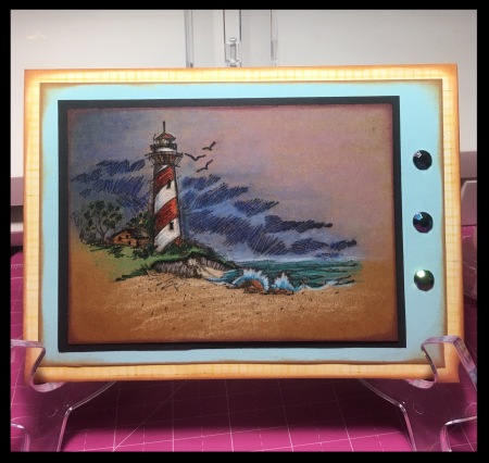
I try to learn from my mistakes, so this next card I just used pencils for coloring. I like it better, but it’s still not my favorite. I think it’s too dark still and the contrast between the light house and the rest just doesn’t do it for me. I need to adjust my color selection due to the darker paper. I think pencils are good, but choosing lighter colors to work with will be better next time.
For the next project I jumped back to white paper, but I wanted to try mixing my copics and prismacolor pencils. I recently watched a few videos of this technique and loved the results that artist got. I still need more work, again, I think it’s color choice and figuring out how the colors will work together. I had to color the image three times before I was happy with the results, but FINALLY, I got to something I liked ok.


Thanks for stopping by!
XOXO

If working on Kraft paper, try inking the image in white pigment ink, then stamping on the kraft paper. this is great with solid images, as once it’s dry, you have a more white background to work with 🙂
Oh! Great idea 🙂 thank you 🙂
Love the lighthouse! Never thought about doing one on kraft but the sand is lovely!!!
I really like how the lighter colors work with the kraft paper 🙂 I always think of dark skies with light houses, but maybe a lighter sky would work in this case 🙂